After looking at different artists and seeing what inspired me most I found that Yousef Harsh, David Dreblin, and Alvin Booth had the most impact.
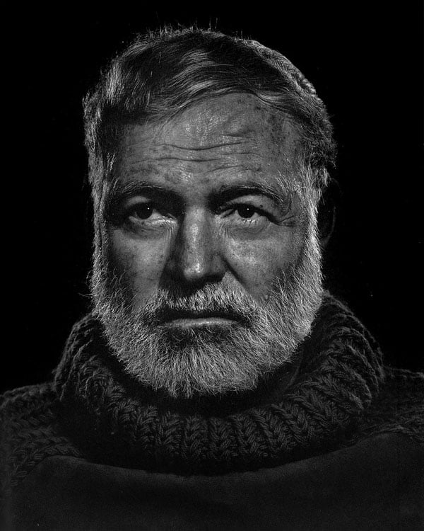
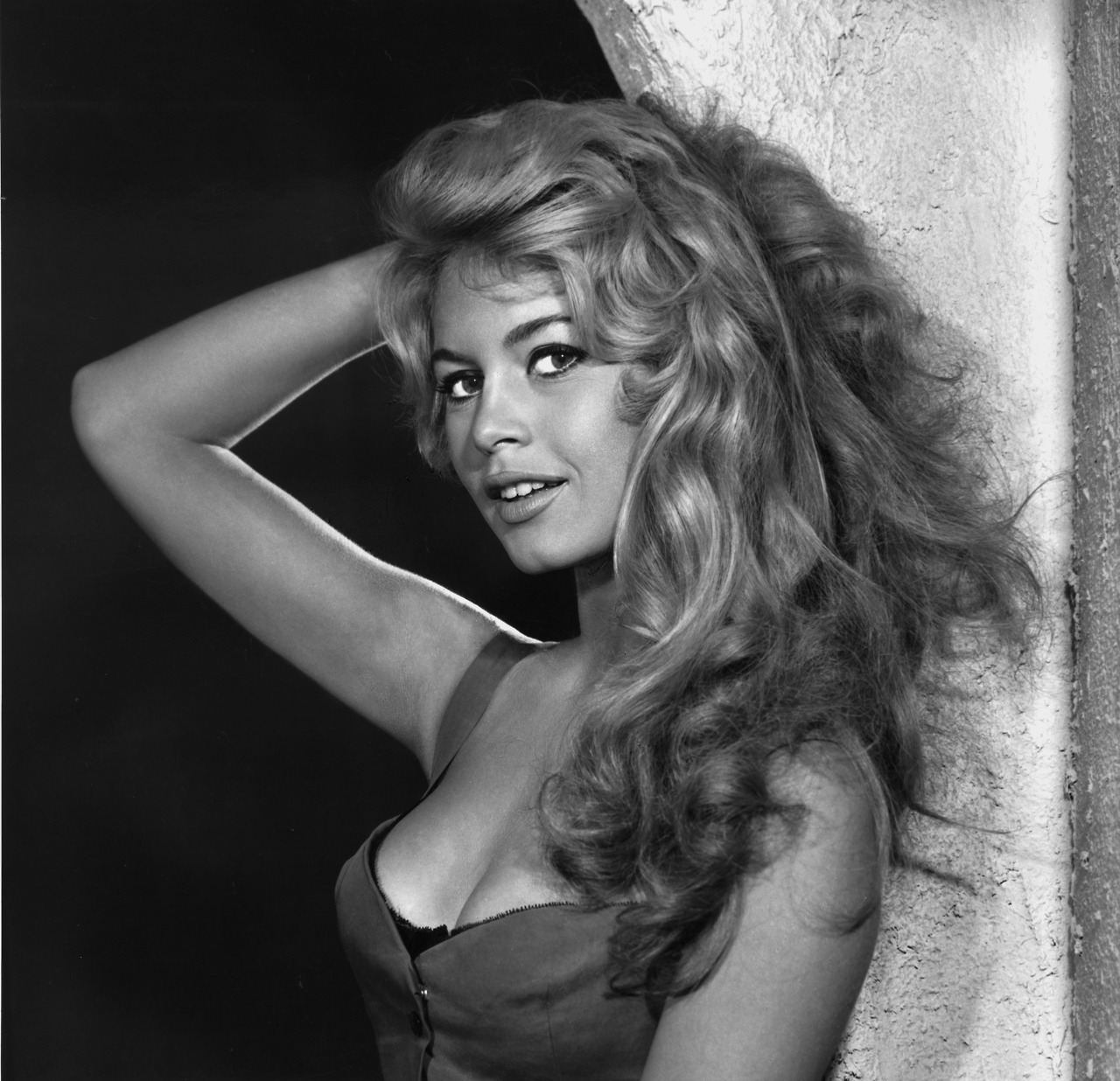
Yousef Karsh is one of the artists whose work is a method I would like to learn. His traditional style of portraiture with primarily head shots and 2/3 body framing, along with strategic posing of the subjects, sets up a shot that creates strong emotion. Karsh's use of lighting is also that of one that I would like to emulate. Highlighting parts of the face or body, in his case of celebrities or well known individuals, with studio lighting is something that draws me to his work. I like the heavy contrast of black and white in his work, as also seen in Ruven Afonador's pictures. (http://www.ruvenafanador.com)
http://www.karsh.org/#/the_work/portraits
http://media-cache-cd0.pinimg.com/236x/8c/2b/0d/8c2b0dc08097d7e7543f1e3bdc4fec83.jpg
http://petapixel.com/assets/uploads/2013/07/Hemingway.jpg
Although his shots of famous women were shot in lighter tones, I do enjoy his glamour work also.
http://33.media.tumblr.com/tumblr_mejwefvOg61rw3fqbo1_1280.png
David Dreblin is another of the artists whose work inspires me. I like his mixture of portraiture and landscape. His use of vibrant colors, using the background of a city and the selection of the appropriate dress on a women, draws the eye in an exceptional way. I like how he uses more of full body framing and at the same time a beautiful city landscape view.
http://www.google.com/imgres?imgurl=&imgrefurl=http%3A%2F%2Fwww.fotografr.de%2F5768%2Fbuchverlosung-david-drebin-the-morning-after%2F&h=0&w=0&tbnid=EU0faddiqQ1xSM&zoom=1&tbnh=184&tbnw=274&docid=zQ6SasXNL6e0DM&tbm=isch&client=safari&ei=ugxVVL70PPDesAS1lYDYAQ&ved=0CAoQsCUoAg
http://www.google.com/imgres?imgurl=&imgrefurl=http%3A%2F%2Fnifmagazine.com%2Fdavid-drebin-the-morning-after%2F&h=0&w=0&tbnid=1qhuiWwstaFgrM&zoom=1&tbnh=201&tbnw=251&docid=yoN_uaIRb3R5XM&tbm=isch&client=safari&ei=ugxVVL70PPDesAS1lYDYAQ&ved=0CAQQsCUoAA
http://www.daviddrebin.com/#/exhibition/47
Alvin Booth is one of the artists that stood out because of his abstract style. This is something that I personally haven't done but interests me greatly. The use of shadows, on and of models, creates stunning photographs.
http://www.artfacts.net/artworkpics/27522b.jpg
http://www.artfacts.net/artworkpics/27492b.jpg
http://www.gallery51.com/index.php?navigatieid=9&fotograafid=32
http://alvinbooth.com/work
Saturday, November 1, 2014
Tuesday, July 22, 2014
Week 8 - final post for the class!!!
I went for a bike ride and found a park to snap some pictures here are a few below. The first one is of benches. I liked this shot of the benches. It takes me to a place where there may be an older couple sitting enjoying the day and the time with each other.

For this next shot, I took a photo of a tree branch and made it b&w and lowered the cyan on. I liked this shot because of the shadows cast on the leaves. I also took out some of the cyan to even the tone.

This next shot was on my ride. I found a image of The Crucifixion. The sun was in the right spot to really make this shot stand out. I had to get really low in order to get the right angle for this.

For this next shot, I found a daddy long legs spider on my grill and set the camera to macro and took the shot. The shadow creates a creepy feel to it.

This was a side shot of pillars. I wanted to crop more out of the shot but it would have taken too much out of the image.

This is a shot of fountain with the rippling water. I kept it color because in b&w, the target seemed to distort and fade a way I did not like.

For my last shot, I took a picture of a wall. In Photoshop, I finally was able to work with the freeform utility effectively. The side of the wall was more askew than this. I think it worked out well.

I have really enjoyed this class and plan to submit many photos in the future to Fotothing in the future. This class has really inspired me to take better photos and analyze the shot and what I want to reveal in the image. I have learned photography jargon to somewhat actually know what I am talking about.
Monday, July 21, 2014
Sarina Lungarini Week 8 (last week!!)
So I had a lot of fun and learned a lot, here is my final post


tried to highlight my dog in the grass from a different point of view
you would think I used a smudge effect but really this is a window at my work!
underneath the window (it's actually gross but it's outdoors and we don't clean every surface)
see the entire window!
Sunday, July 20, 2014
Week 8 and final post.
This has been quite the journey. My photographic eye has changed dramatically. In completing this project for photography, I have discovered that I actually do have a hidden artist within myself deep down. I am not able to look at shots differently and decide whether they would fit with my work or not. Researching and following Keith Carter has been exciting. Black and white photos are vintage, and have a special air to them. It feels like home to me. So, in my final goodbye... I have captured all of my best shots of this week....


I have enjoyed this artistic journey immensely. Until we meet again....
Week 8 - Maks Danilin
This has been a great class and I have learned a lot about
the proper way to take a picture. I always just took a picture and if it
was in focus it was good enough for me. Now I keep in mind what the subject
is and the quality of light. For this week’s
assignment I did not focus solely on one style but used a few that interested
me. The first shot is of a small wooden sculpture
that cast a shadow onto the wall. I
cropped the shot to keep the attention on the subject only. I had to darken the image because the lacquer
in the wood created too much of a shine.


Monday, July 14, 2014
Week 8
Week 8
Just go shooting! Pick your favorite place to shoot or your favorite method from the possibilities presented here so far. Love the beach?... show me more beach images using different light at different times of the day. Love macro work? Keep going.. research the topic more, push harder... explore macro on a rainy day, get in closer, etc... Keep posting to the class blog .
All good things must come to an end and sadly this is our last week. We had a small group but a very good group. Everyone worked hard and submitted an excellent range of images. I was very pleased with the results this time around. Hope to see you on campus sometime!
Sarina Lungarini- Week 7
I traveled to several places, though it was hard for me to zoom in on certain things that I really wanted to capture


Here I visited Italy, and I really wanted to capture these statues so I adjusted brightness and contrast
this was in St. Petersburg Russia, I thought the fountain was just gorgeous so I zoomed in as much as I could and I cropped quite a bit so I could just get this, however it's not exactly the angle I would prefer, but it's something I couldn't help unless I went there myself.
These were also in Russia, and i played a lot with the color on the Second one but the first one was mostly contrast and brightness.
These last two are from Venice, a place I hope to visit in the future. I love the landscape of it and played a lot with color and brightness.
While this assignment was interesting, I must admit it wasn't my favorite, I would have much rather actually visited these places and taken my own photos.
Sunday, July 13, 2014
Virtual Photos
This weeks assignment was rather fun. Using Snipping Tool was actually fun and useful.
For this picture I liked the lines along with the color. I set the contrast high to really bring out the green, red, and the awning color.

For this photo, I just left it alone. The colors on the buildings surrounded by the overcast clouds and somewhat dimness of the town makes this picture different.

I really like the angle of this photo. The houses on this angle makes the white stand out. I took a shot of the rooftops but they did not come out as expected.

I set this photo b&w. I really like the contrast black railings against the white walls.

This picture I set the contrast really high (right before it became overly distorted) to bring out the reflection of what is in front of the ac units.

For this photo, I had to crop it a lot and set the rotation to .5 twice equaling to 1 ccw to make the lines straight. I also brightened it to really make the shelf stand out from the shadow it was hiding behind.

For the next photo, I realized that I could have zoomed in on the details on the walls, but I wanted to make the windows stand out. The shadows from each window was my focus here.

This next shot is my favorite. I like the reflection of the city on the side of the building. The angle makes the building look like it will go on for awhile.

I like this view from the window. For me it gives the depth of the height of the building. It gives an eerie feeling of looking down the side of the structure.

For this shot, I really wanted the umbrella to stand out against the sand. I set the brightness and contrast higher. I like the shadow from the sun on both objects.

I took this one for the the top of the eye. Its bright to make the focal point to make the pods stand out.

I switched the steps to b&w and cropped it to avoid the photo tag that was on it.

Subscribe to:
Posts (Atom)